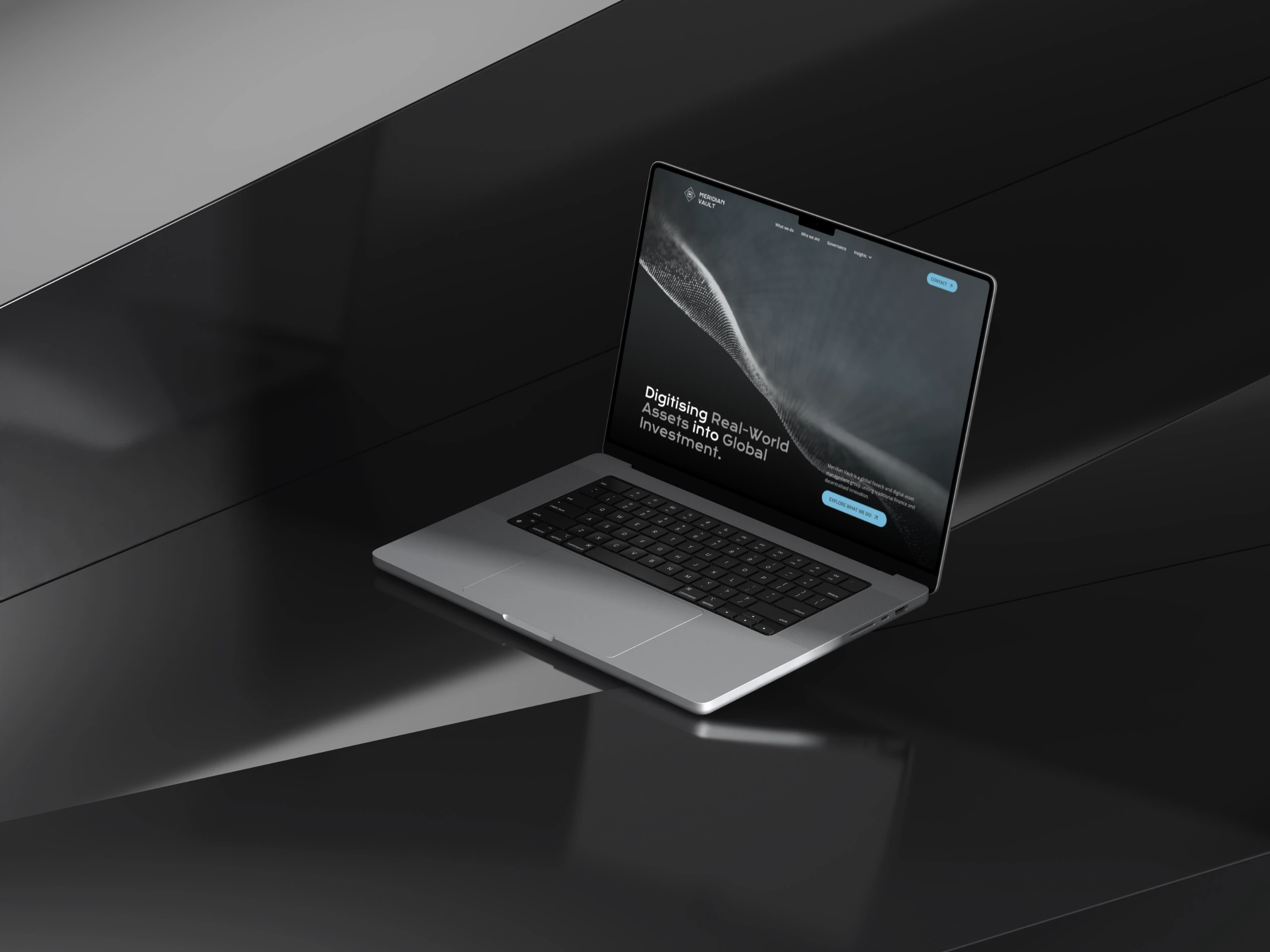
From Clutter to Clarity: A Fintech Rebrand, Approved in One Round
Role
UI/UX Design, Web Development
Year
© 2026
Project under
Manning & Co. Group

Overview
Client details in this case study have been altered to protect confidentiality.
Meridian Vault came to the table with a dated brand identity and a website that no longer matched the caliber of its business. I led the end-to-end design and development process: simplifying the brand, restructuring the site's information architecture, and building it out with a set of custom micro-interactions the team hadn't used before.
Challenge
The existing site was visually inconsistent and structurally unclear:
Brand elements (color, type) had grown ad hoc over time, with no unifying system
Navigation and content hierarchy made it hard for visitors to understand what Meridian Vault actually offered
The site didn't reflect the quality or positioning of the business it represented
Opportunity
A tighter brand system paired with clearer IA wouldn't just make the site look better, it would let visitors understand the offering faster and give the client a foundation they could build on with confidence.
Scope
Led the end-to-end design-development process
Simplified brand identity (color, typography)
Information architecture and UI design
Full site development
Introduced custom micro-interaction patterns
Colaboration
Collaborated closely with a graphic designer, the managing director, and a developer
The Process





Brand Identity
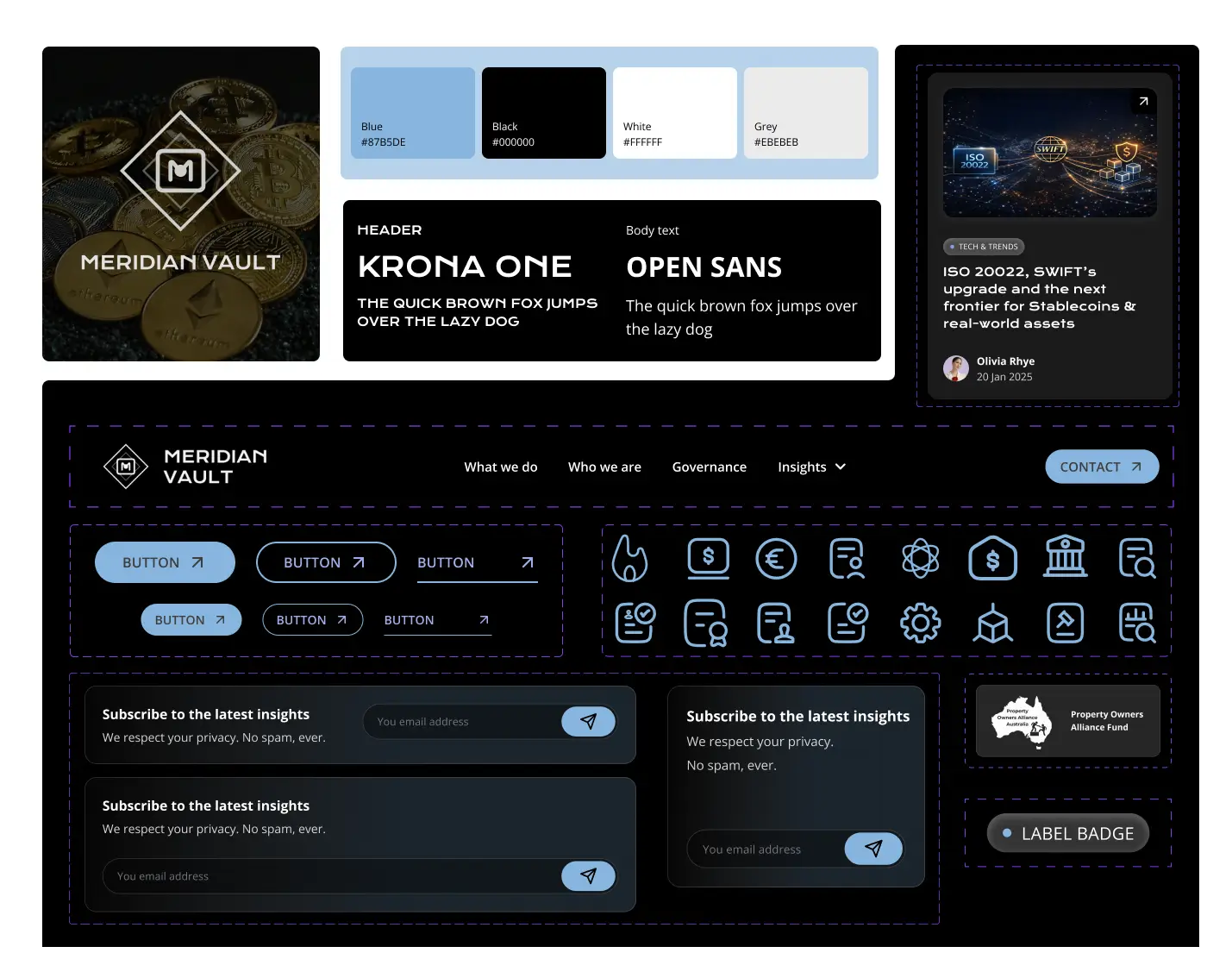
The brand's original palette was scattered and competing for attention. I narrowed it to a smaller, higher-contrast set of colors that reinforced a single, more confident brand feeling, and paired a cleaner sans-serif for legibility with an accent typeface to carry personality in headlines. This tighter system became the backbone for everything downstream, and it's part of why the final design cleared review without a single revision.
Information Architecture
With the brand simplified, I restructured the site's content hierarchy around what visitors actually needed to find first, cutting the noise that had built up around it.
UI Design
UI decisions followed directly from the new IA and brand system: consistent spacing, type, and component patterns across every page, so the site read as one coherent product rather than a set of one-off pages.
Development
I built the site myself, working closely with the developer and managing director to make sure design intent survived the handoff.
Micro-interactions
I introduced a set of micro-interaction patterns that were new to the team: small hover and transition details that added polish without adding friction, reinforcing the more confident brand system underneath.
Design system
Once the brand direction was set, I translated it into a working design system: spacing and type scales, a component library (buttons, cards, form fields, navigation states), and consistent interaction states across the site. Having this in place before UI design started meant every page was built from the same set of parts, which kept the visual language consistent and made the build itself faster since components didn't need to be reinvented page by page.
Results
The design was approved by the client on the first round, no revision cycles before moving into development. For a project with this much surface area (brand, IA, UI, and build), that's a strong signal the process itself was working: decisions were being made with enough clarity and buy-in along the way that nothing needed to be re-litigated at review.
Insights
A simplified brand system isn't just a visual cleanup, it's a decision-making shortcut. Once the palette and type were locked, IA and UI choices had a clear reference point to be judged against, which is a large part of why review was fast.
Key Takeways
A tight, well-reasoned brand foundation speeds up everything built on top of it
First-round approval isn't luck, it's a byproduct of aligning decisions early, not just executing well at the end
Small interaction details are where craft becomes visible to the people reviewing the work