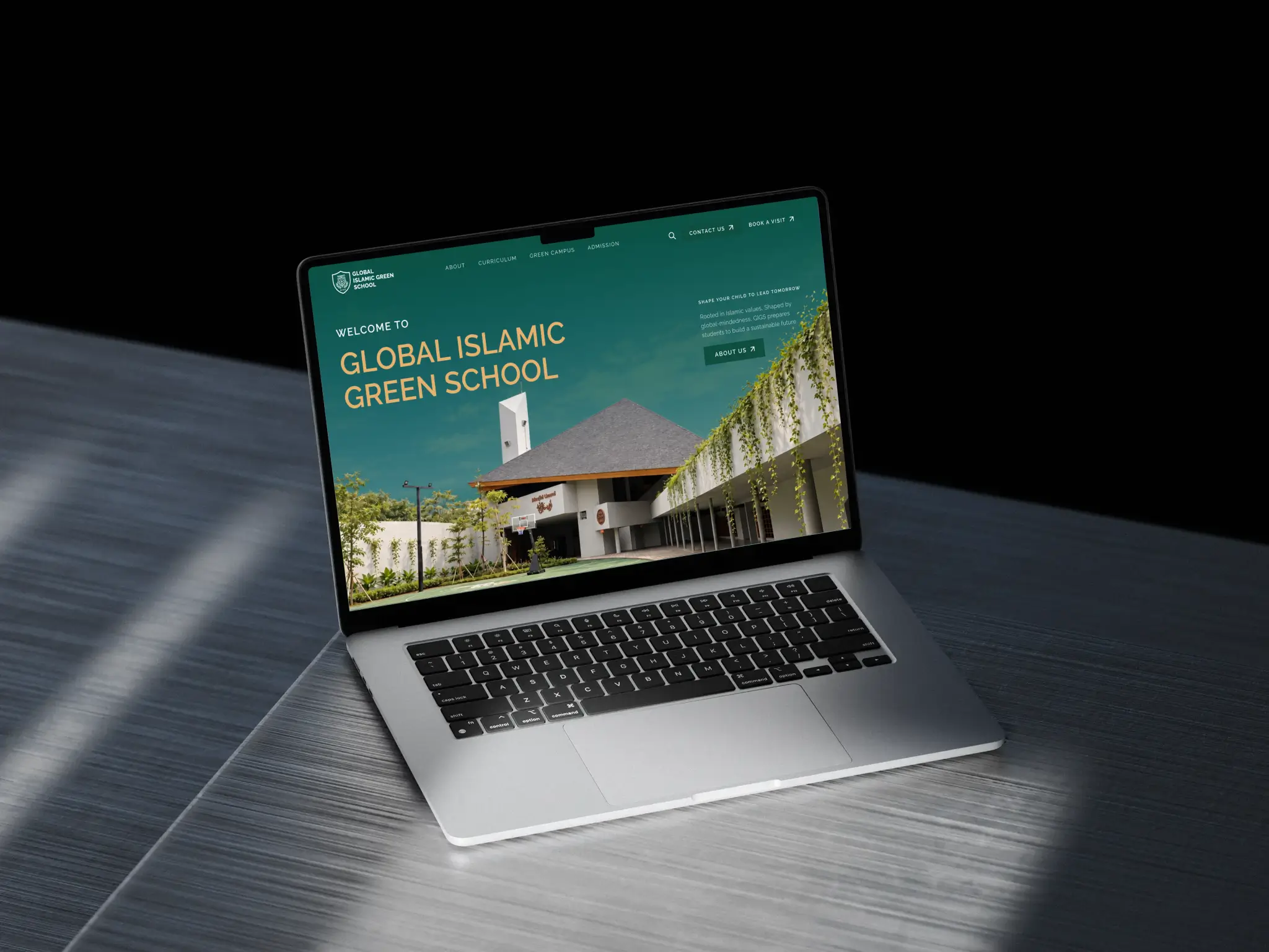
From Unclear to Guided: Shaping the Direction of the Gigschool Website
Scope of Work
Year
Project under

Overview
GIGSCHOOL (Global Islamic Green School) is a bilingual Islamic school with a holistic approach and a global mindset. The brief asked for a visual refresh of its website. Early on, in the call where we presented the initial homepage design, a bigger problem surfaced: the old site was unclear and not informative enough, with no clear direction from one screen to the next. That moved my role from executing a refresh to shaping the direction of the site: its brand, its structure and its flow.
Challenge
The old site (gigschool.id) told parents about the school, but it did not guide them. A parent comparing kindergarten and primary grade options had to work out the route on their own.
An unclear flow. There was no clear direction from one screen to the next.
A brief that stopped at the surface. The request covered visuals only, not structure.
A shaky brand base. The client’s brand guideline defined the logo, three colors and patterns, but not how to use them, so the school’s materials led with navy in print and green online, and there was no clear system to design from.
Copy still in progress. One client contact was writing the content for the whole site.


Opportunity
Gigschool, founded in 2024, needs to be known before it can be chosen. For a new school, the website carries that work: it has to inform parents and guide them to the pricelist or enrollment, without leaving them wondering what to click next.
The Design Question
How might we help parents exploring kindergarten and primary schools quickly see what makes a new school like Gigschool distinct, and find their way from Home to Admission?
Scope
A company profile site of six pages: Home, About, Curriculum, Green Campus, Admission and Contact.
What I was responsible for
UX review and discovery
Brand guideline adjustment, with the client's permission
Information architecture and content mapping
UI design for all six pages
Interaction direction, together with the developer
Collaboration
Collaborated with the school's sole point of contact, a developer and a project manager.
The Process
Looking beyond the brief
The brief was a visual refresh. Before our first call, the client filled in a form covering their goals, audience, pain points, style and scope. In the call, we presented an initial homepage design to propose the style direction, and we dug into how parents, the main users, behave. That is where we raised the brand guideline and the UX as things worth revamping, and the scope grew to include the information architecture.
 |
User persona of GIGS' users |
Brand Identity
With the client's go-ahead, I worked on the brand in parallel with the IA. The guideline they shared was inconsistent and unclear, so I adjusted it: keeping what the school already owned and changing what worked against it.
Kept: the client's colors and the leaves pattern, so the school still recognizes itself.
Tightened: the guideline itself, so the same rules apply on every page.
Changed: the shape language, from all rounded to sharp corners. The school building's architecture is part of what makes Gigschool unique, and sharp corners bring that into the interface.
Mapping information and content
Alongside the brand work, I mapped the information and content for the six pages around the Home to Admission flow, so each page has a clear job in getting a parent to the pricelist or enrollment.
Three decisions came out of it:
I proposed a clearer flow from Home to Admission and reflected it in the navigation menu.
I moved the school philosophy, which was buried under the Curriculum page, up to the Home page.
I introduced forms for admission, contact and booking, and proposed a booking visit section on the site.
 |  |  |
Navigation menu update for better flow | Philosphy moved to home page and details for each value added | Admission form introduced to GIGS School |
Three iterations and a final review
The move from the first to the second iteration was my own call: I was not happy with the first direction and pushed it further. Along the way I joined a call with the client contact to help direct her in writing the copy, since the layout depends on the words it holds. A later iteration came when she changed her mind about the copy and the design had to adjust to fit.
The last step was a call with the client, giving her room to raise any final requests and serving as the last review before development. She was happy with the design direction and had only minor requests for the copy.
Interaction, planned with the developer
I briefed the key interactions I wanted, such as the wheel and the card click trigger, and left the rest, like fade-ins and scroll behavior, to the developer's judgment. When something turned out not to be feasible, we talked it through and brainstormed alternatives together. Scroll-triggered animation is planned with GSAP as the main library. Settling interaction during design keeps motion supporting the Home to Admission path instead of being added at the end.
Results
The design was finalized and approved, and the site is now in development. It is not live yet, so there are no performance numbers to report.
What exists today is a six-page design built around one path, from Home to Admission, with a brand system that is consistent across every page and a sharper visual identity drawn from the school's own architecture.
What happens next: launch is planned for the end of November 2026. Until then, the developer and I are in close discussion about how the design is implemented, with alternatives ready where the original plan needs adjusting. The measure I designed toward is simple: a parent who lands on Home reaches Admission and gets the pricelist or enrolls.


Insights
A new school needs a site that informs, not only one that guides. For a school founded in 2024, brand awareness was the priority. A site that was jumpy and thin on information would not have built it, so the redesign had to do both jobs.
A style proposal can open a bigger conversation. The initial homepage was meant to propose a visual direction. It became the moment we dug into how parents behave and raised the brand guideline and the UX.
Design and copy move together. A late change to the copy cost an iteration. Helping the client write her content, and keeping a final review call before development, left only minor copy requests at the end. Starting that support earlier is what I would do next time.
Brief what matters, trust the rest. I defined the key interactions and left the other motion decisions to the developer. When something was not feasible, we brainstormed alternatives together, and that discussion continues through the build.
Key Takeways
Collect the client’s needs before the first call, so the call itself can go deeper into how users behave and set clear expectations.
Hold a final review call before development, so last requests land before the build begins and the timeline and budget do not overrun.
Stay close to the developer after approval. Implementation raises questions, and finding alternatives together is part of the job.
Don’t get too attached to your drafts. Let user insight and team feedback guide you, and be willing to redo the work until it speaks for the brand.