
From Friction to Flow: How Data Guided Manning & Co’s Homepage Redesign

Overview
Manning & Co.’s homepage was suffering from Information Overload, resulting in high bounce rates and user frustration. Leveraging Microsoft Clarity behavioural analytics, I transformed a cluttered, high-friction interface into a high-performance entry point. By restructuring the visual hierarchy and implementing purposeful micro-interactions, I bridged the gap between complex B2B content and intuitive navigation, directly improving prospective clients engagement across global markets.
Challenge
Despite strong visuals, the original homepage suffered from friction points that impacted engagement:
Too much layout shifts during load, causing elements to jump unexpectedly
Users clicking non-interactive components (“dead clicks”)
Frequent “quick backs,” signaling confusion or poor content flow
Shallow engagement across key pages (Portfolio, Blog, About)
Opportunity
The primary opportunity lay in translating brand strength into functional clarity. By redesigning the homepage into a performance-driven experience, I could transform passive 'scrollers' into active 'explorers,' using motion design not just for aesthetics, but as a tool to reduce cognitive load and guide user intent.
Scope
Layout redesign, interaction design, motion design (GSAP), testing and iteration
Colaboration
Collaboration: Worked with designer, content team, and PM to ensure smooth implementation and brand consistency.
The Process





Audit & insights
Reviewed analytics and session recordings via Microsoft Clarity to pinpoint pain points such as layout instability, drop-off hotspots, and shallow engagement.
High-fidelity design
Developed a modern, high-fidelity layout that emphasised above-the-fold storytelling and scannability. The focus was on creating a clean, structured visual system, with consistent spacing, typography, and component hierarchy, to strengthen clarity and guide user flow effectively.
Development + interaction design
Implemented Staggered Information Reveals using GSAP to prevent user overwhelm by introducing content sequentially. By controlling the tempo of information delivery, the visual focus guided toward primary conversion points.
Monitor & iterate
Tracked post-launch data and user sessions through Microsoft Clarity and analytics tools to identify friction points and performance gaps.
Results
Comparative analysis via Microsoft Clarity validated the redesign. Below is the performance delta compared to the initial audit:
Quick Backs: Reduced from 20.83% to 17.07% (-18%). Improved information architecture especially in crucial sections (e.g. Hero and About Us), ensured that destination content matched user expectations, increasing navigation confidence.
Dead Clicks: Reduced from 12.50% to 7.32% (-41%). By clarifying visual affordances and removing non-functional elements, I eliminated user frustration.
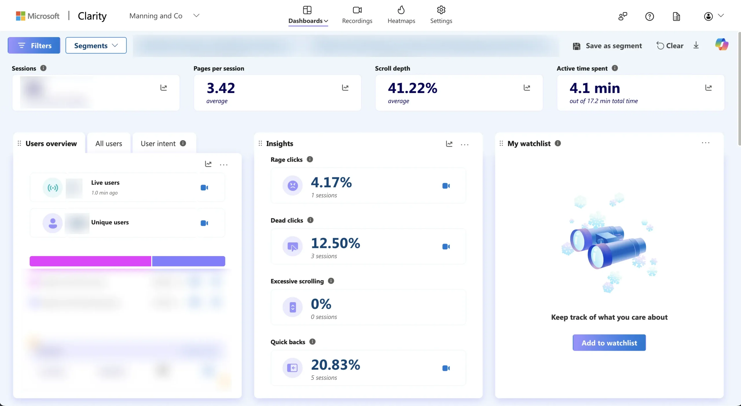
Before: High Quick Back rates indicated a mismatch between user intent and core sections messaging.

After: Strategic restructuring of information hierarchy led to a significant reduction in navigational friction.
Before and after comparison
The visuals show a clear before-and-after transformation. The original layout was cluttered and confusing, causing friction for users. The redesign streamlines the structure with micro-interactions that guide users smoothly through the experience.
Insights
User flow improved: Visitors clicked with more purpose and navigated more fluidly through key sections.
Enhanced Value Proposition Clarity: By aligning the visual hierarchy with user intent, the landing experience converted 'Passive Scrollers' from LinkedIn into 'Active Explorers,' increasing the average click-through rate to high-value service pages.
Trade-offs: While the redesign successfully solved key friction points, the high-fidelity interactions initially impacted load speeds. I’ve planned a performance-focused V2.0 sprint to r<b>efactor assets and further optimise performance</b>, with a clear target to bring the <b><i>LCP under 3 seconds</i></b> without losing the purposeful motion that drives current retention.
Key Takeways
Design and performance are inseparable. A smooth interface must be supported by optimized technical performance.
Data-driven iteration works. Real user data validated improvements and clarified where to focus next.
Collaboration matters. When designers and developers align on performance metrics, every design decision supports a faster, smoother experience.