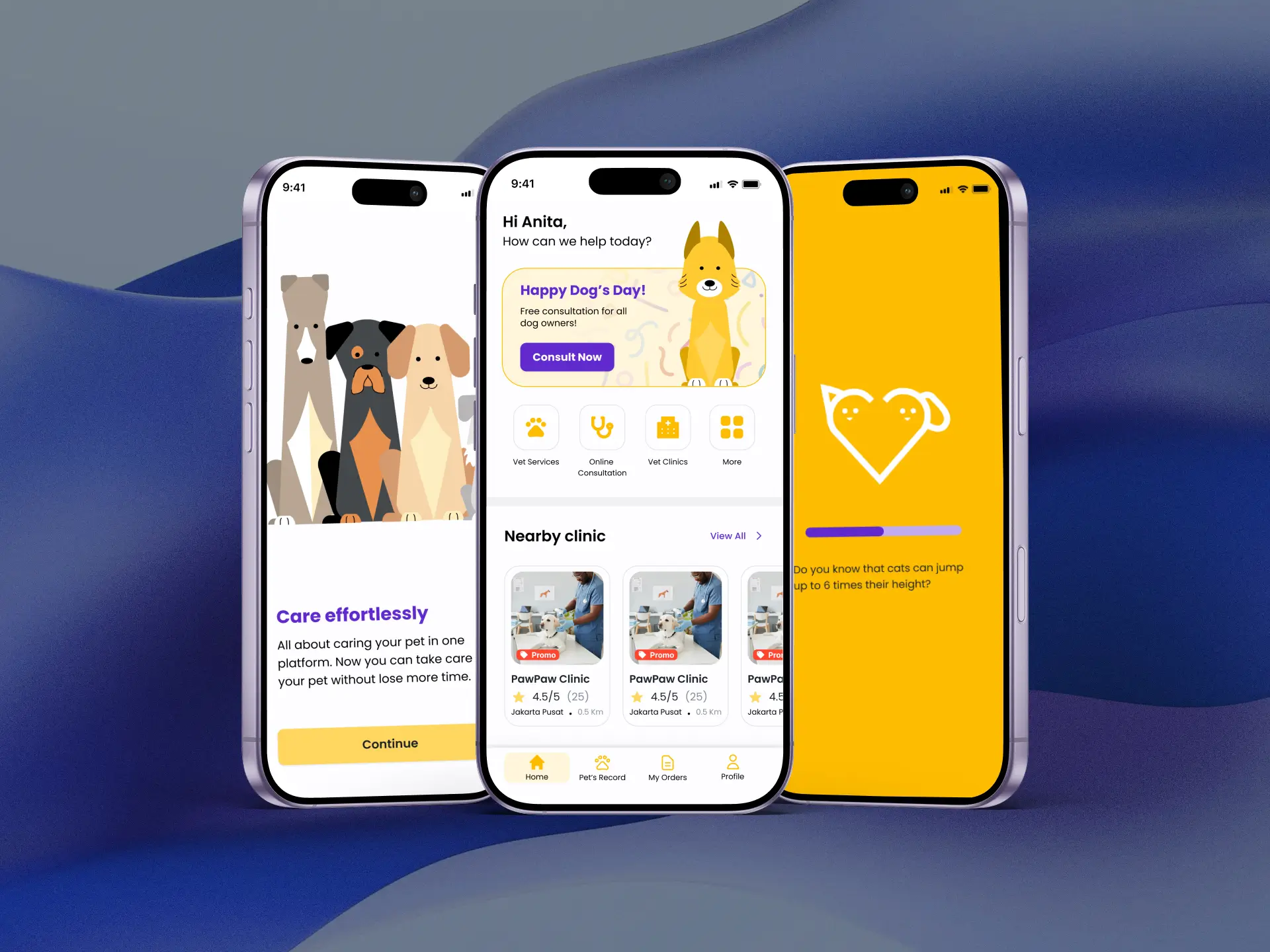
My Vet App
Role
Year
Project under

Overview
My Vet App is a mobile app concept that gives pet owners one place to book vet services, consult a vet online, and read verified pet-health articles. We built it as our final project for the Rakamin Academy UI/UX Designer Bootcamp (Batch 8): a team of four, about two months, from first survey to tested prototype.
Challenge
Pet owners want the best care for their pets, but finding it takes more effort than it should.
Clinics are far away, and owners have little time to search.
Google results show outdated opening hours, ratings that don't match, and vets whose credentials are hard to check.
Owners end up asking strangers on social media for advice.
Opportunity
Most pet-care apps are add-ons to human health platforms, so few are built around pet owners. That left room for an app that brings booking, online consultation, and trusted information into one place.
The design question
How might we make it easier for pet owners to get efficient, accessible vet services?
Scope
User research, personas, information architecture, user flows, wireframes, high-fidelity prototype, and two rounds of usability testing over about two months.
Tools used: Miro, Whimsical, Figma, Maze.
Collaboration
Collaborated with 3 other designers, working alongside our day-to-day commitments.
The Process





Research & Insights
Surveyed 27 pet owners, interviewed six, and benchmarked four competitors. The pattern was clear: owners can't trust the information they find online, and they have little time to look for it.
Define & Prioritise
Grouped findings in an affinity map, wrote five "How Might We" questions, and shaped two personas. We then scored ideas by impact and effort to lock six MVP features, including service booking and online consultation.
Structure & Design
Mapped two core flows, booking and consultation, and used closed card sorting to shape the information architecture. Wireflows validated the layout before we built the high-fidelity prototype.
Test
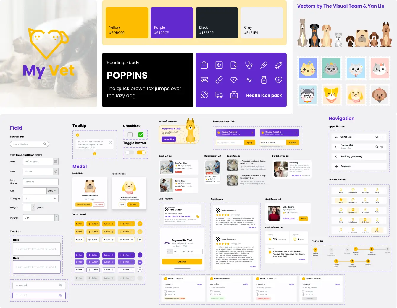
We mapped two core flows, service booking and online consultation, then used closed card sorting to shape the information architecture before moving into wireflows and high-fidelity screens. The visual system uses Poppins for readability, yellow as the primary color for warmth, purple as the secondary, and a 4-column grid on a 390px mobile frame.
Design system
The concept we chose: Friendly, Readable, consistent. Poppins sets a seven-level type scale. Yellow leads for warmth, with purple as the accent. Five shadow levels signal elevation, and a 4-column grid on a 390px mobile frame keeps every screen aligned.
Results
The first Usability testing on Maze didn't meet our expectations. Follow-up interviews showed the problems were about clarity, not appearance:
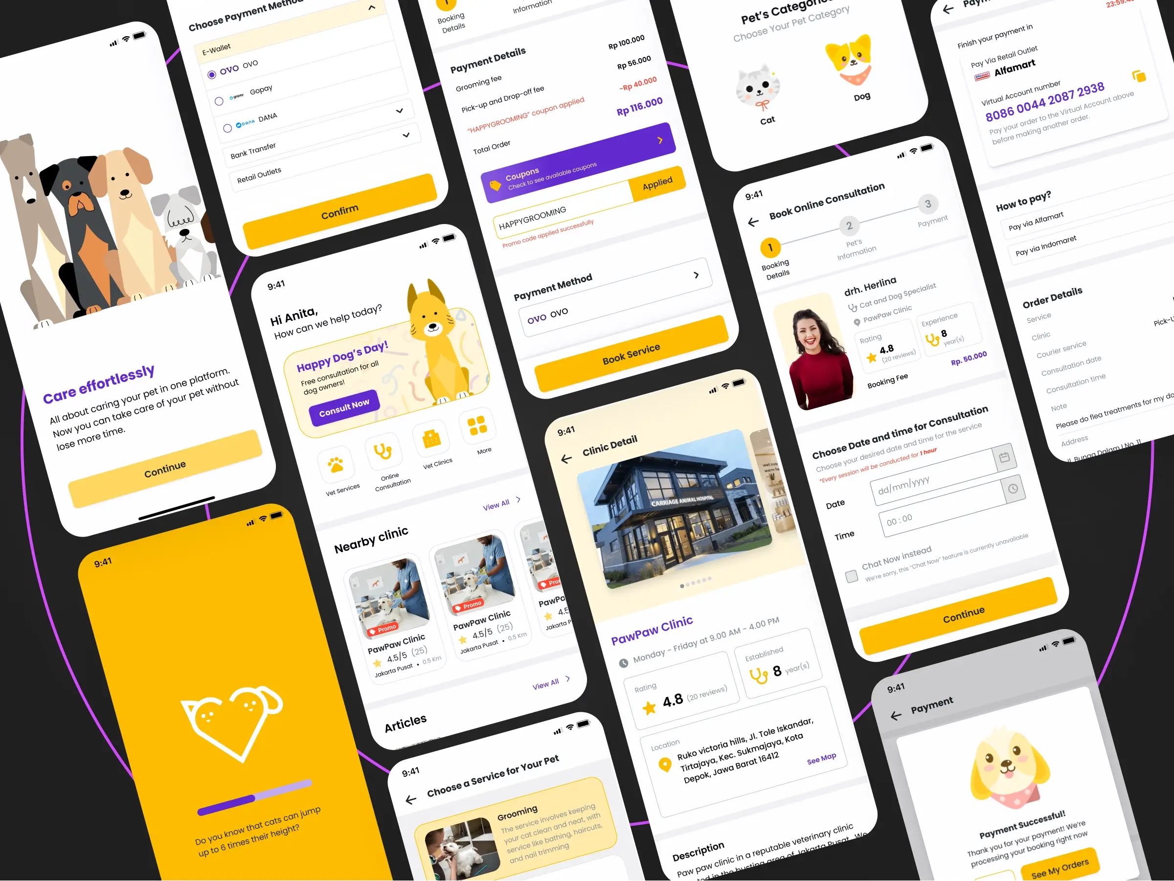
Naming: "Grooming" was hard to find under "Clinics," because users read "Clinics" as medical care only. We renamed it Vet Services and redesigned the icons so each service was easier to tell apart.
Flow: Booking was too long and led to misclicks. We put the service first and the clinic second, so the flow became Service → Clinic → Review → Booking instead of Clinic → Clinic choice → Review → Service → Booking.
Micro-copy: Testers showed frustration on pages that lacked context, so we added guidance text where people were getting stuck.
Checkout: Testers clicked repeatedly at the coupon field because the applied-coupon state was grey and easy to miss. We changed it to red. We also showed a default payment method as a cue for how to choose one.
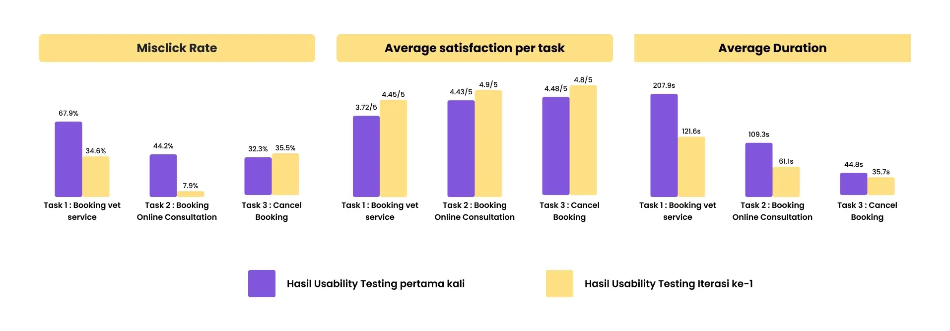
Usability testing comparison - Iteration 1&2
After iteration: the second round
The revised prototype reached an overall satisfaction score of 4.7/5. A second round with five new participants showed significant improvement in usability metrics.
Insights
Our research pointed us in the right direction, but the first design didn't get there. The problems weren't about looks. A category name users misread, a booking flow that started in the wrong place, and a coupon state that was easy to miss each stopped people from finishing a task. Small decisions about wording and hierarchy decided whether the app worked.
Key Takeways
Test the solution, not just the problem. Research shows what to build. Testing shows whether you built it right, so plan for a second round.
A label is an IA decision. Name things the way users think of them. "Clinics" hid grooming, and "Vet Services" made it easy to find.
Show when an action worked. People click again when nothing seems to happen. Make every state change easy to notice.