Hola everyone, Austenita's here!
In this post, I'd like to share the whole journey in the making of MY VET APP prototype
My Vet App is an application design created by Group 2 to complete the final project of the RAKAMIN ACADEMY UI/UX DESIGNER Bootcamp Batch 8. Our group consisted of 4 members: Farah, Hafizah, Dhiya, and Nita, all of whom played active roles throughout the process—from initial user research to validating the proposed solutions—amidst our daily activities.
Overview
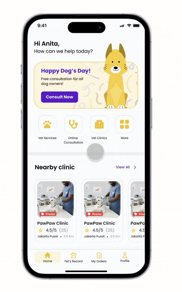
My Vet App provides a variety of services, ranging from grooming, sterilisation, and medical checkups to online consultations with veterinarians. Additionally, the app offers a collection of credible, informative articles to help pet owners maintain their pets’ health.
We developed the prototype within a relatively short timeline of about 2 months:
- User and Product Research : 7 days
- Insight Synthesis: 9 days
- Ideation Process : 20 days
- Design Solution Process : 14 days
- User Validation : 9 days
By the end, the My Vet App prototype achieved a satisfying overall user satisfaction score 4.7/5.
Background
Problem
Recently, the number of pet owners has been increasing. Naturally, as responsible pet owners, they always strive to provide the best for their pets in terms of comfort, safety, and health. There are times when a pet’s health declines and requires veterinary care, leading to common problems faced by owners.
These issues range from difficulty finding the nearest vet clinic, frequently encountering incorrect information regarding emergency care for sick pets, consultations with vets of questionable credibility, to the time constraints of pet owners. Their busy activities become a challenge, especially for new pet owners who still lack knowledge and experience.
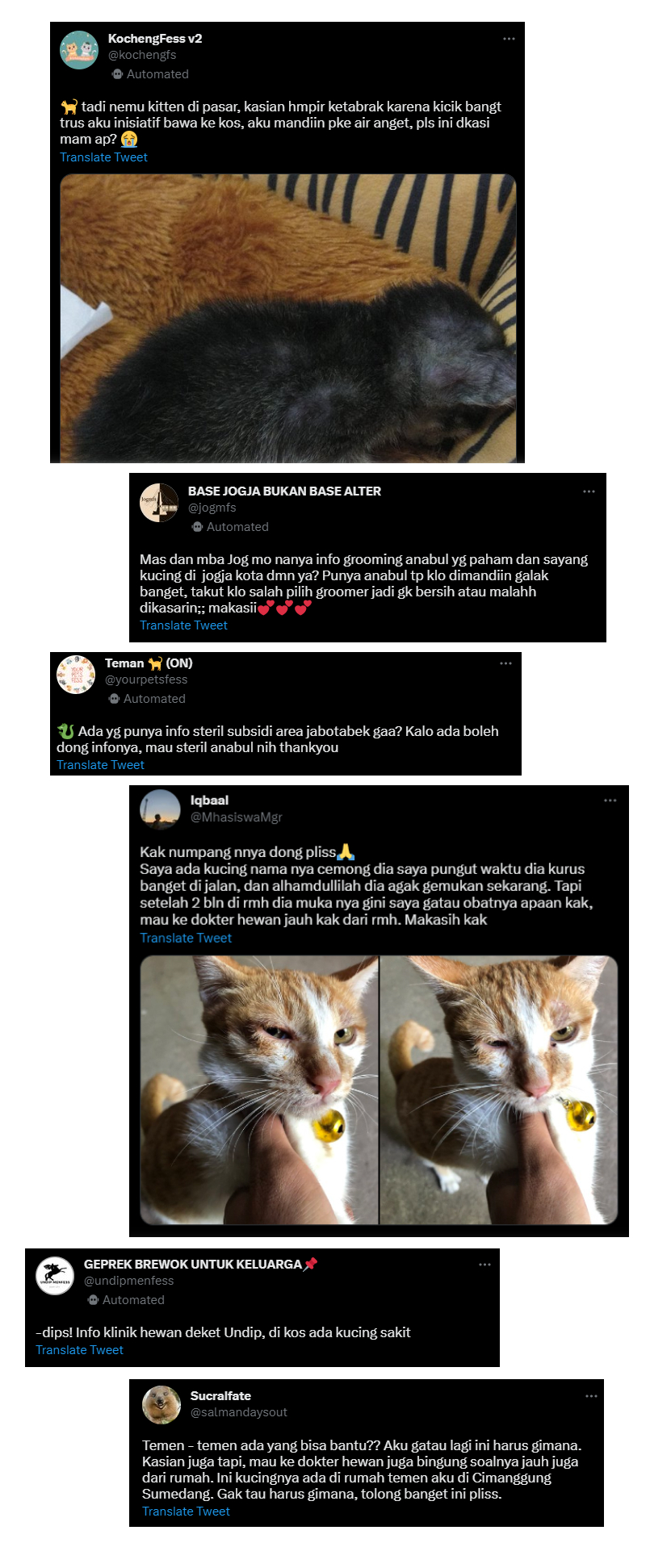
Due to the difficulty of accessing information and time limitations, many pet owners are confused about finding valid information. It is not uncommon for owners to ask on social media (such as Twitter bases), which often fails to solve the problem.
While technology continues to evolve and has the potential to improve accessibility and convenience for pet owners, there are not many pet care applications available on the market. The majority of these apps are integrated into consultation apps for humans, meaning few services are specifically tailored to accommodate the needs of pet owners in maintaining their pets’ health.
Goals of this research
This research was conducted to further understand the needs and desires of pet owners regarding the motivations and frustrations they experience in caring for their pets. Additionally, our team sought to find unique features that could serve as a “plus point” compared to competitors, considering current and future technologies.
Based on these challenges, we formulated several questions to be answered:
- Understand the motivations and frustrations of pet owners.
- Identify unique features that offer a competitive advantage.
- Determine how pet owners currently manage medical records and how likely they are to use a dedicated app.
The Design Process
We used the Design Thinking framework that includes: Empathize, Define, Ideate, Prototype, dan Test.
Empathize Phase
Validating Problems
The previously mentioned issues could not be the sole reference for this research. Therefore, our team decided to explore the points of view of pet owners—such as pain points and expectations—using surveys and in-depth interviews. We also conducted benchmarking against competitor products to find gaps and offer room for improvement.
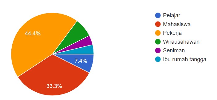
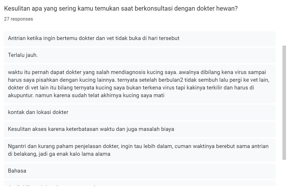
Surveys were conducted to determine how many pet owners faced similar problems across various backgrounds (age, daily activities, and experience visiting the vet). We received 27 respondents: 44% were employees, 33% students, and the rest were entrepreneurs and stay-at-home parents who own cats and dogs. Most respondents cited difficulties like clinics being too far away, time constraints, and inaccurate diagnoses.
In-depth interviews were conducted with 6 pet owners to gain a deeper understanding of behaviour, feelings, and experiences. Key findings included:
Finding 1
Difficulty finding reliable information on Google (e.g., outdated hours, mismatched ratings, or low doctor credibility).
Finding 2
Positive response to pet pickup/drop-off services for non-medical needs.
Finding 3
Positive response to concise, educational content that is verified and valid.
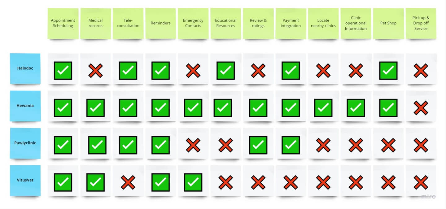
We analysed competitors like Halodoc, Pawlyclinic, Hewania, and VitusVet to identify missing features. We summarised these in a Feature Comparison Matrix.
Define Phase
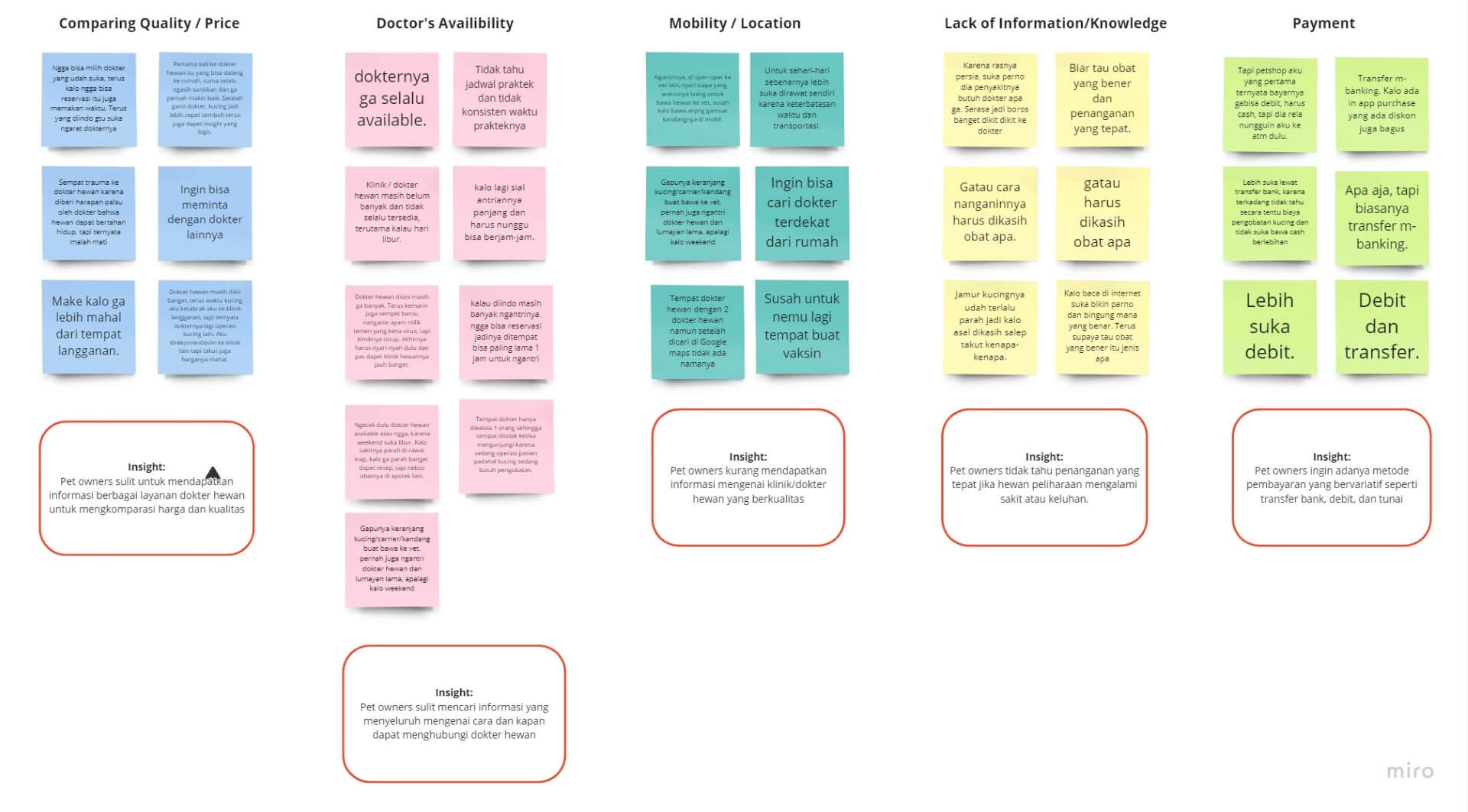
Insight Synthesis
We created an Affinity Map using Miro to group findings into categories, which helped us develop “How-Might-We” (HMW) questions.
Design Challenge
The HMW Questions
- How might we provide vet and clinic recommendations that suit owner needs?
- How might we make it easier for owners to get vet services without time constraints?
- How might we educate owners on proper pet handling and treatment?
- How might we offer mobility convenience for owners to transport their pets?
- How might we offer ease of payment for vet services?
How might we make it easier for pet owners to get efficient and accessible vet services?
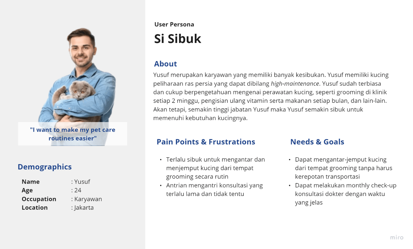
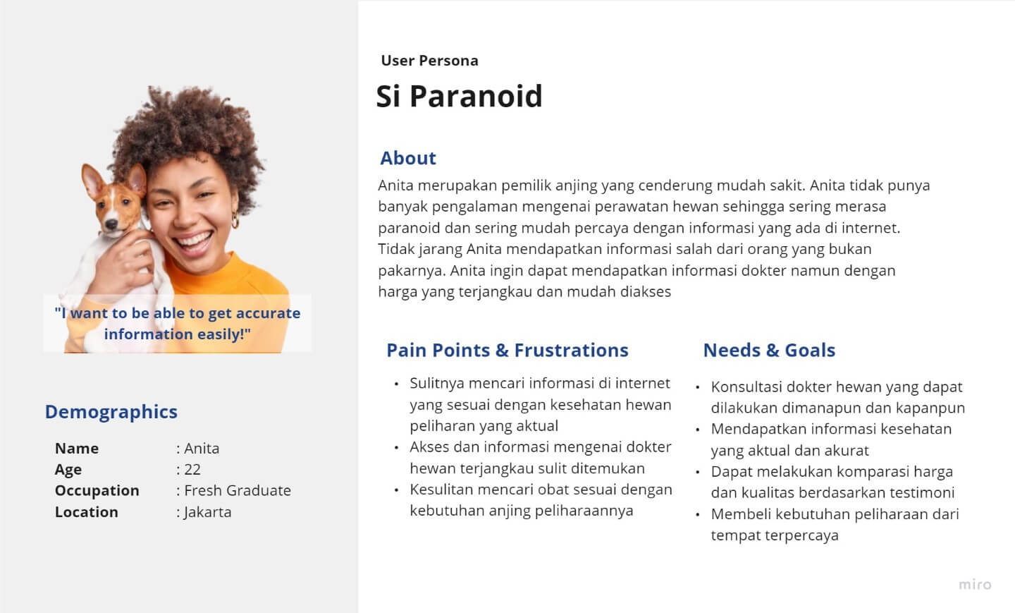
User Persona
We identified two representative personas: “The Busy One” and “The Paranoid One.“
Ideate Phase
Feature Prioritization
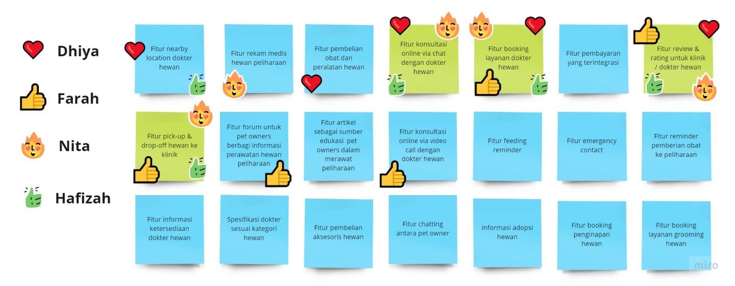
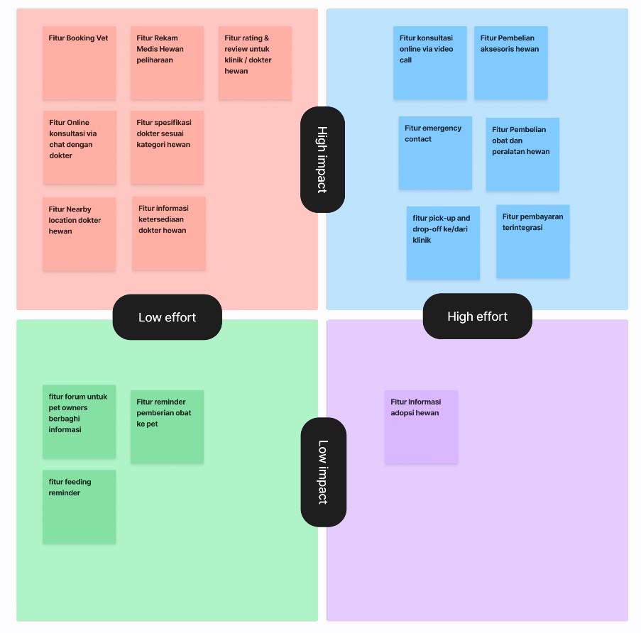
We brainstormed and voted on features based on a High-Low Impact & Effort matrix to determine the Minimum Viable Product (MVP). We decided to prioritise:
- Booking Vet Services
- Pet Pick-up / Drop-off
- Rating & Reviews for clinics/vets
- Online Consultation via chat
- Vet classification by animal speciality
- Nearby Vet location
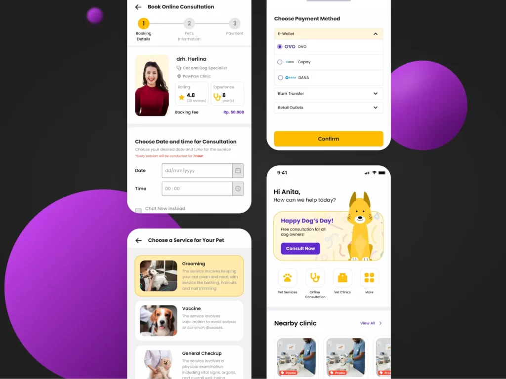
Design/Prototype Phase
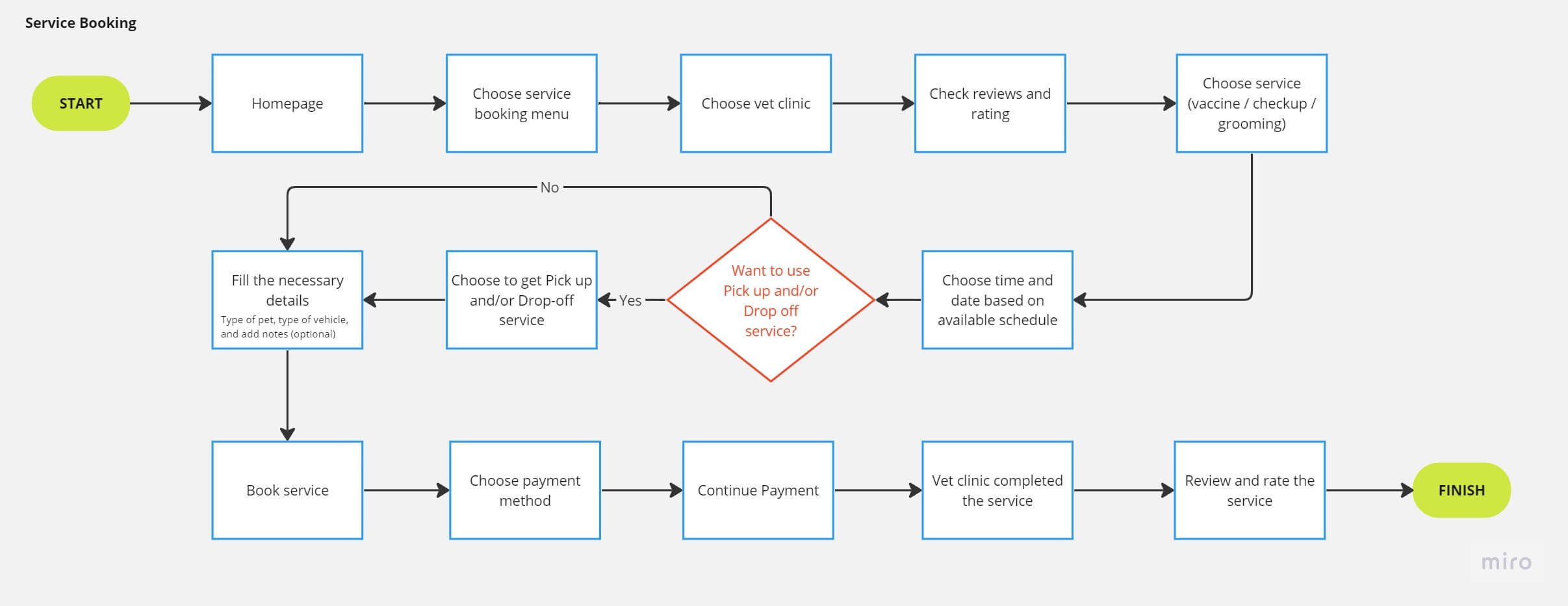
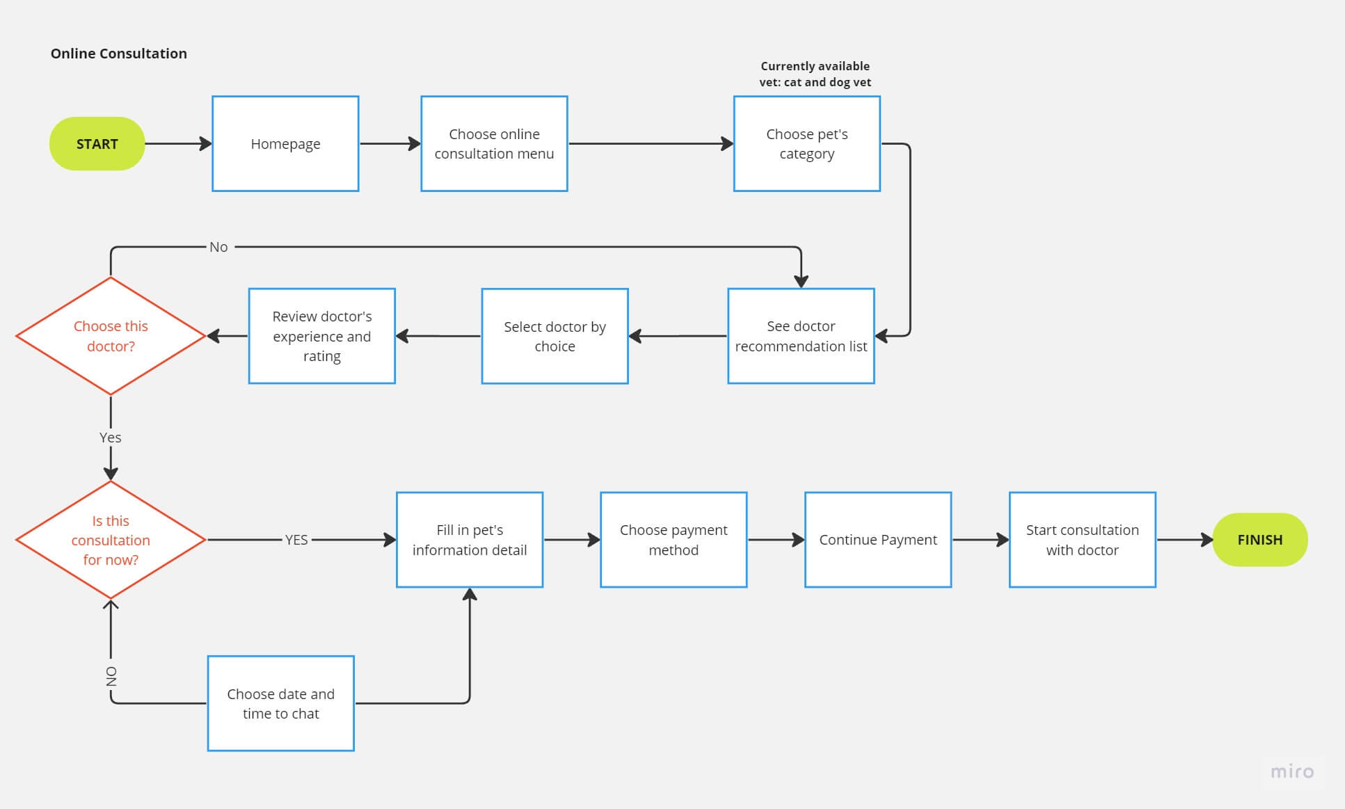
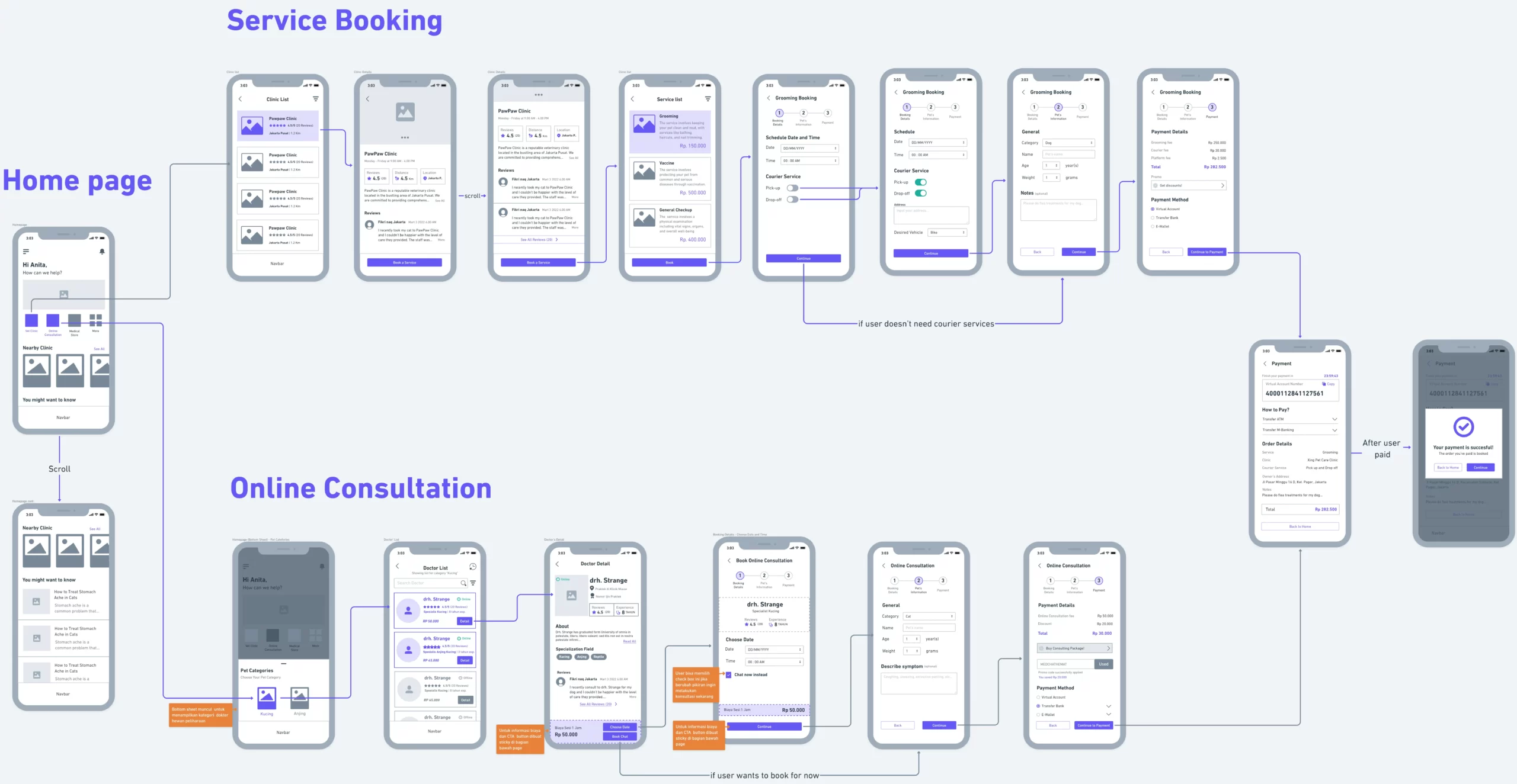
User Flow & Information Architecture
We established two main flows: Service Booking and Online Consultation. We then created sketches and used closed card sorting to define the Information Architecture (IA).
Wireframe & Screen Flow
Using Whimsical, we built wireflows to validate the components.
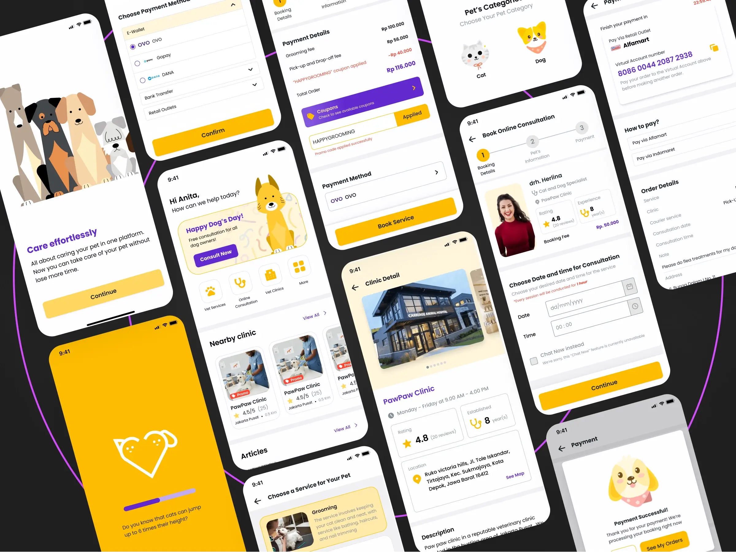
Let the fun part begin, the High Fidelity Prototype!
Design Guidline & Components
For the High Fidelity design, we established:
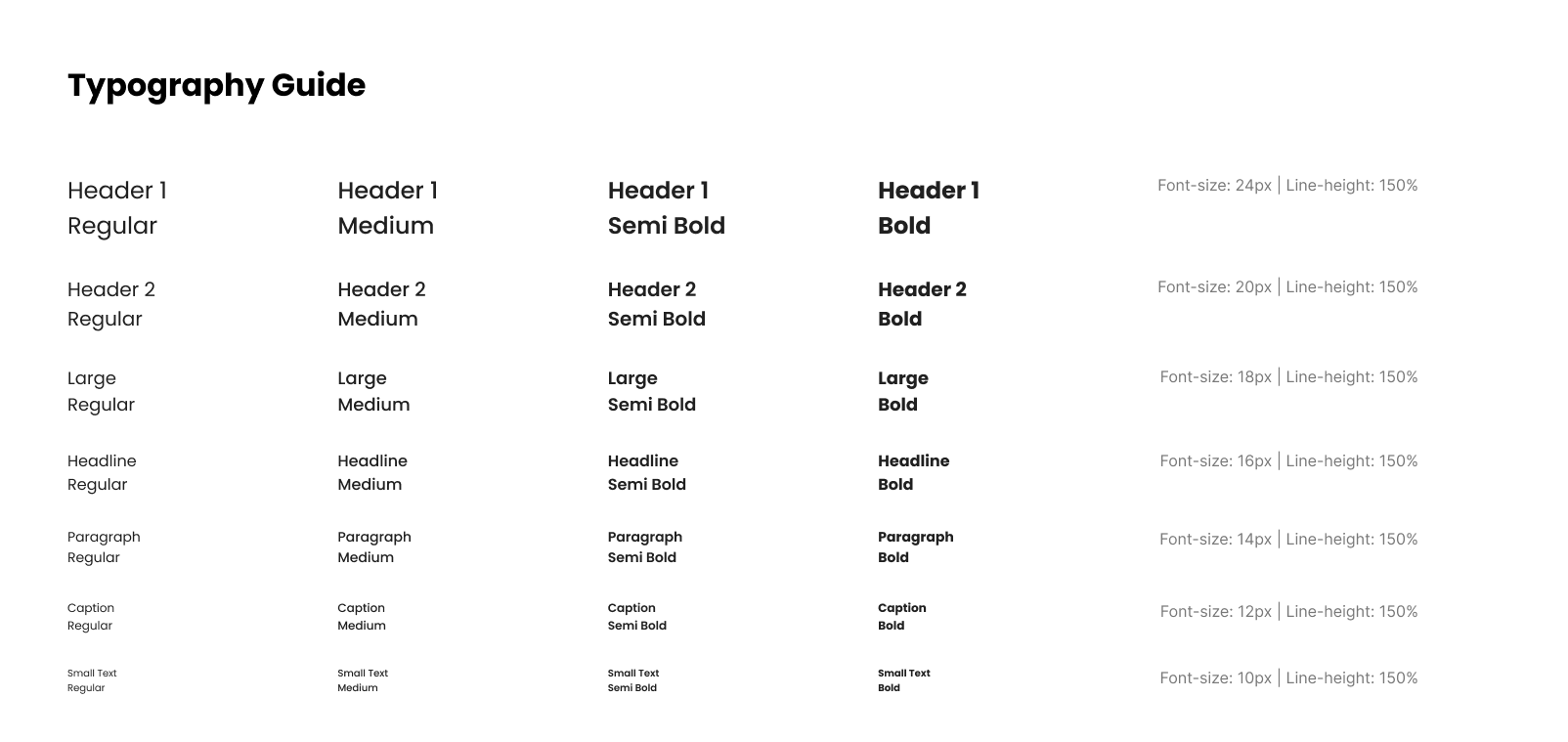
Typography
Poppins is a sans-serif typeface that provides a simple and friendly design impression for the user, making it well-suited for this project. Additionally, the Poppins font offers high readability, ensuring that users can more easily obtain information according to their needs.
There are 7 established font size hierarchies: header 1, header 2, large, headline, paragraph, caption, and small text. These hierarchies are set according to the text requirements within the application.
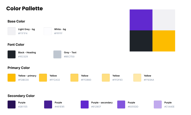
Color Pallete
In this project, we used two colours for the app: Yellow (Primary) and Purple (Secondary).
Yellow is the primary colour in our design, as it can evoke positive and cheerful feelings in the user. It also gives a friendly and pleasant impression, which aligns with our goal of creating a user-friendly experience.
Meanwhile, we used purple as the secondary colour to provide an elegant and creative touch. Furthermore, purple can also convey a sense of sweetness, which fits our aim of providing a memorable and heartfelt experience for the user.
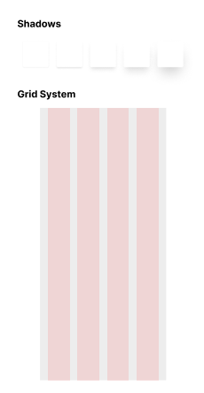
Shadow and Grid
Shadows are created to provide visual cues for the user by giving objects an “elevated” feel. For this project, we defined five types of shadows, each with different levels of blur and spread, to create distinct cues when applied to design components.
The grid system was established to ensure consistent margins for every screen. For this system, we used Figma’s default 4-column layout since the prototype is mobile-based—specifically referencing the iPhone 14 with a width of 390px—resulting in 24px margins and gutters.
Test Phase
Last but not least, Testing Time!
We tested the prototype with pet owners using Maze to validate our solutions.
First Testing Results
The initial results did not meet expectations. Through secondary interviews, we found:
- Feature names were not representative (e.g., "Grooming" was hard to find under "Clinics").
- The booking flow was too long and confusing.
- Visual ambiguity regarding active/inactive states led to high misclick rates.
- The payment process was not descriptive enough.
Usability Testing - Iteration 1
Based on the feedback, we made the following changes:
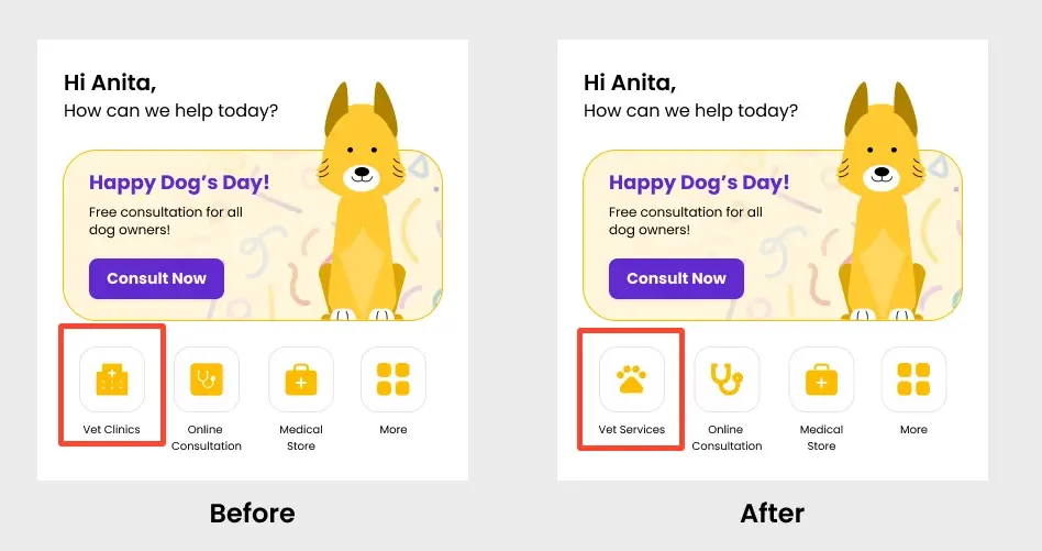
Feature name change
The first change we made after conducting the initial test was renaming the “Vet Clinics” feature to “Vet Services”. We did this because the name “Vet Clinic” turned out to be less representative of the various services offered within it, as many users associated the word “CLINICS” solely with medical services (e.g., clinics, hospitals, etc.) for pets.
Additionally, we replaced the icons with a more unique and clean design to better capture attention and allow users to distinguish between different services more easily.
Flow Booking Service
From the results of the first prototype test, we realised that one of the factors causing the high misclick rate and the long duration required for users to complete the vet service booking task was a flow that was too long-winded, which left several users frustrated when searching for the “Grooming” service. Consequently, we decided to change the flow so that users can find the required services more quickly.
Previous flow:
Vet clinic -> choose clinic -> review clinic -> choose service -> booking
Current flow:
Vet services -> choose service -> choose clinic -> review clinic -> booking
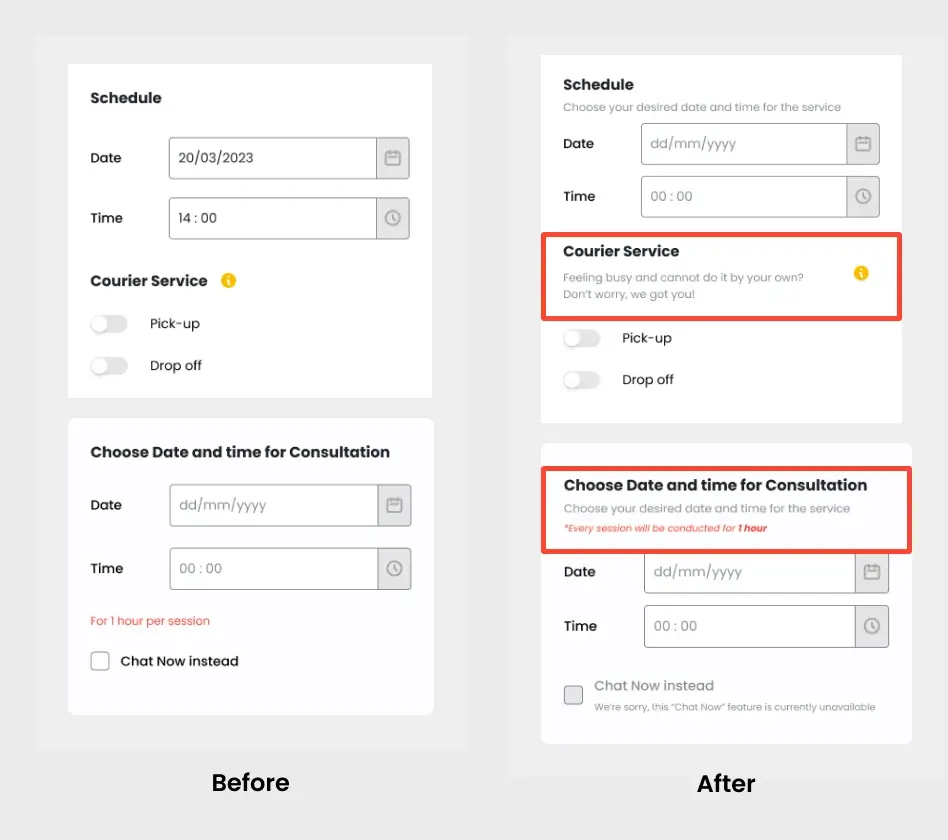
Micro-copy adjustments
The next improvement we made was refining the micro-copy on the prototype. After analysing the usability test report, we noticed that several testers showed signs of “frustration” and spent more time on pages that lacked sufficient information.
Therefore, we added micro-copy to various sections of the prototype so that users can quickly understand the information provided and complete their tasks with ease.
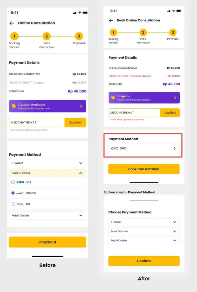
Booking/Checkout pages refinements
The Booking/checkout page became our next concern after conducting the first prototype test. There were two specific areas we improved on this page: the colour change for the applied coupon information and the “Payment Method” layout.
In the payment details section, we observed a behaviour where testers tended to perform “aggressive clicks” when prompted to enter a coupon code. We realised that the grey colour used previously failed to grab attention, leading many users to not realise that the coupon had been successfully applied. Consequently, we changed the discount text colour from grey to red. With this change, we expect that the state change (coupon successfully used) will be more noticeable to users in the future.
As for the Payment Method section, we made changes because, in the previous design, not many users knew how to select a payment method. Therefore, we modified it by displaying one of the default payment methods as a cue for users to select their preferred payment option.
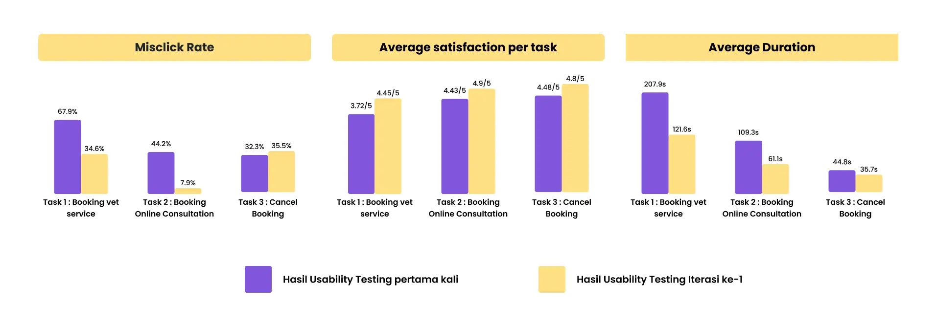
We tested with 5 new respondents and saw significant improvements in usability metrics.
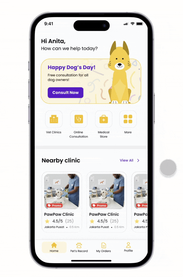
Check Out the Prototype
Here is our latest prototype of My Vet App, feel free to try it out!
PS: if you find the prototype way too small, you can always try it on Full screen mode by clicking the “ ” icon on the top right corner of the prototype
Conclusion
Key Takeways
User involvement is vital
Solutions developed from research still need active validation, as they may not meet user expectations initially.
Visual Hierarchy and UX Writing are crucial
Micro-copy significantly impacts how easily a user can digest information or complete a task.