Redesigned the Manning & Co. homepage to resolve user friction. By utilising Microsoft Clarity behavioural data, the new interface achieved a 41% reduction in dead clicks and an 18% improvement in navigation retention (Quick Backs), streamlining the path for global stakeholders while increasing average scroll depth.

Overview
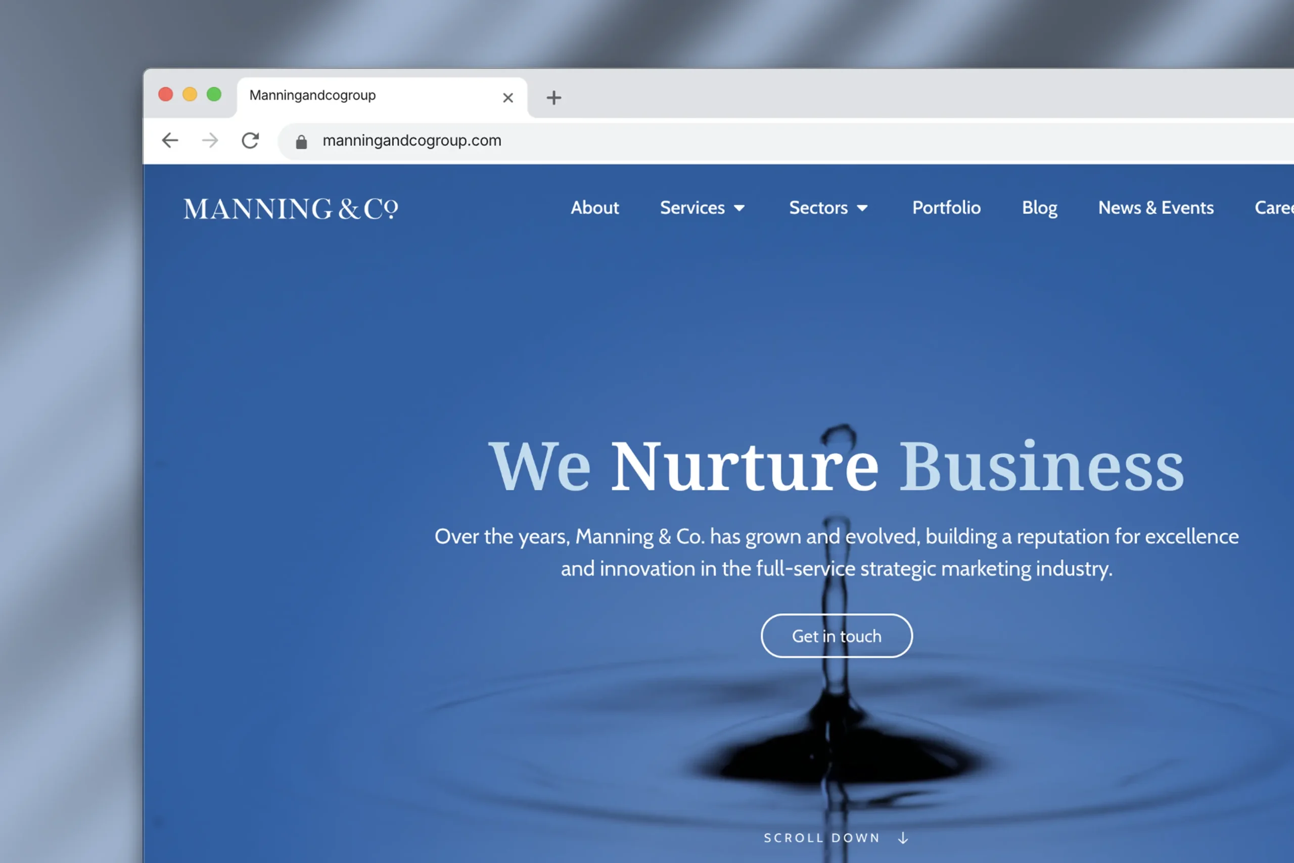
Manning & Co.’s homepage faced two main issues: low visitor engagement and content-heavy sections that made the page feel cramped and hard to navigate. Using insights from Microsoft Clarity, I led a full homepage redesign to create a cleaner layout, improve visual balance, and enhance the browsing experience — resulting in smoother interactions and stronger user retention.
Challenge
Despite strong visuals, the original homepage suffered from friction points that impacted engagement:
- Too much layout shifts during load, causing elements to jump unexpectedly
- Users clicking non-interactive components (“dead clicks”)
- Frequent “quick backs,” signaling confusion or poor content flow
- Shallow engagement across key pages (Portfolio, Blog, About)
Opportunity
By redesigning the homepage into a modern, interaction-driven experience, we could create a more intuitive entry point into the site—building trust and encouraging exploration. Leveraging micro-interactions and motion design offered a chance to reduce cognitive load and subtly guide user behavior.
Project Scope
- Scope: Layout redesign, interaction design, motion design (GSAP), testing and iteration
- Collaboration: Worked with designer, content team, and PM to ensure smooth implementation and brand consistency.
Design principles
- Clarity: Simplified the interface to highlight key messaging and CTAs.
- Engagement: Integrated GSAP-powered micro-interactions to create delight and improve navigation flow.
- Trust: Refined visual hierarchy and brand consistency to build credibility at first glance.
Process
Audit & insights
Reviewed analytics and session recordings via Microsoft Clarity to pinpoint pain points such as layout instability, drop-off hotspots, and shallow engagement.
High-fidelity design
Developed a modern, high-fidelity layout that emphasised above-the-fold storytelling and scannability. The focus was on creating a clean, structured visual system — with consistent spacing, typography, and component hierarchy — to strengthen clarity and guide user flow effectively.
Development
+ interaction design
Implemented GSAP-powered micro-interactions to enhance responsiveness and engagement. The final design was developed using Elementor, with additional custom HTML and CSS to extend functionality and ensure pixel-perfect alignment with the intended motion and layout behaviour.
Monitor & iterate
Tracked post-launch data and user sessions through Microsoft Clarity and analytics tools to identify friction points and performance gaps.
Results
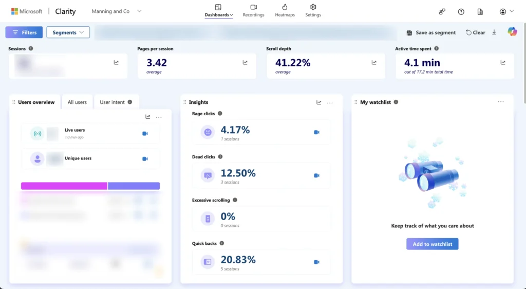
Quantitative analysis via Microsoft Clarity highlighted a 20.83% Quick Back rate and 12.50% Dead Click rate, signalling a clear need to restructure core page sections and provide more distinct value propositions. Below is the comparative data retrieved from the initial audit:
- Quick Backs (20.83%): This indicated that messaging in core sections (e.g. Hero and About Us) did not align with user expectations, leading to immediate exits.
- Dead Clicks (12.50%): Users attempted to interact with non-clickable elements (such as icons or static imagery), confirming an ambiguous visual hierarchy.
Before

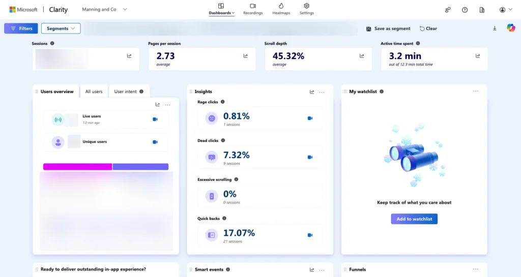
After

| Metric | Before | After | Impact |
|---|---|---|---|
| Sessions | 256 | 805 | ⬆️ +214% traffic growth |
| Unique Users | 103 | 340 | ⬆️ +230% reach |
| Dead Clicks | 13.28% | 9.44% | ⬇️ Reduced frustration |
| Quick Backs | 24.22% | 11.68% | ⬇️ Strong improvement |
| CLS (Layout Stability) | 2.2 | 0.81 | ⬆️ Major stability fix |
| Pages / Session | 4.20 | 2.59 | ⬇️ Shallower engagement |
| Active Time | 4.3 min | 2.4 min | ⬇️ Shorter visits |
Scroll to see the before/after


Before-after visual comparison
The visuals below show a clear before-and-after transformation. The original layout was cluttered and confusing, causing friction for users. The redesign streamlines the structure with micro-interactions that guide users smoothly through the experience.
Insights
- User flow improved: Visitors clicked with more purpose and navigated more fluidly through key sections.
- Traffic expanded: Improved SEO and LinkedIn integration significantly boosted reach and acquisition.
- Trade-offs appeared: While the redesign successfully met engagement and accessibility goals, the inclusion of complex GSAP micro-interactions and high-fidelity media increased the initial Page Load time to 8.6s. As a hybrid designer-developer, I have prioritised a performance-focussed V2.0 sprint to address this. My roadmap includes:
- Asset Refactoring: Implementing WebP conversion and lazy-loading for all primary imagery.
- Script Optimisation: Transitioning to a code-splitting approach to ensure GSAP dependencies only load when required.
- LCP Targets: My objective is to bring the Largest Contentful Paint (LCP) back under 3.0s without compromising the purposeful motion design that drives current user retention.
Key takeways
- Design and performance are inseparable. A smooth interface must be supported by optimized technical performance.
- Data-driven iteration works. Real user data validated improvements and clarified where to focus next.
- Collaboration matters. When designers and developers align on performance metrics, every design decision supports a faster, smoother experience.